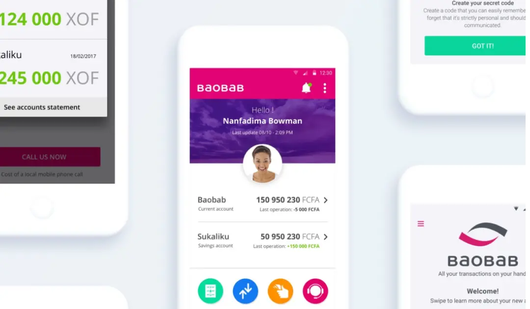
Baobab Mobile
Design a mobile banking app for financially excluded populations in Senegal and Madagascar with low literacy, unreliable internet, and deep mistrust of institutions.
Built a colour-coded navigation system, SMS balance check for offline use, video tutorials for onboarding, and conducted guerrilla field research in Dakar and Antananarivo.
- MVP ready in six months with user-validated features - Strongly positive qualitative feedback from field testing - Product shaped by real context: colour coding, SMS features, video tutorials
I led the design of a mobile banking app for Baobab Group to serve financially excluded populations in Senegal and Madagascar. Through guerrilla field research, we discovered users relied on YouTube tutorials, needed offline functionality, and responded better to colour-coded navigation than text labels. I managed a team of three designers, built clickable prototypes in InVision, and conducted testing rounds in both countries. The MVP was ready in six months and received enthusiastically positive feedback from users who had never had access to banking services.
Overview
Baobab Group is a leader in digital financial inclusion, serving individuals and small businesses across Africa and China. In 2016, the group made a strategic decision: to go beyond microfinance and become a real bank. The first step was a mobile application that would let anyone open an account, pay bills, transfer money, and apply for a microloan. Simple on paper. Genuinely complex in practice.
The context
Financial exclusion in sub-Saharan Africa is not a fringe issue. In many of the countries where Baobab operates, the majority of the population has no access to formal banking services. The barriers are real: no way to prove identity through official documents, low literacy rates, unreliable internet access, and a deep-seated mistrust of institutions that have historically ignored this part of the population.
Baobab had something most banks didn’t: a decade of ground-level presence in these markets and real relationships with its clients. The ambition was to use that knowledge to build something genuinely useful rather than just transplanting a standard fintech product into a context it wasn’t designed for.
The application had to launch in Senegal and Madagascar as a test market. The core features were defined with the CEO and operations team: account creation, energy bill payments, money transfers, and microloan applications (the Taka credit product). Six months to build and test the MVP.
My role
I led the design of the product end to end, from early concept through to the clickable prototype used in testing. I managed a team of three designers, including two based in Dakar who handled on-the-ground research. I was involved in the earliest strategic conversations about what the MVP should be, shaped the user flows and interface, and travelled to both Senegal and Madagascar to run testing sessions directly with users.
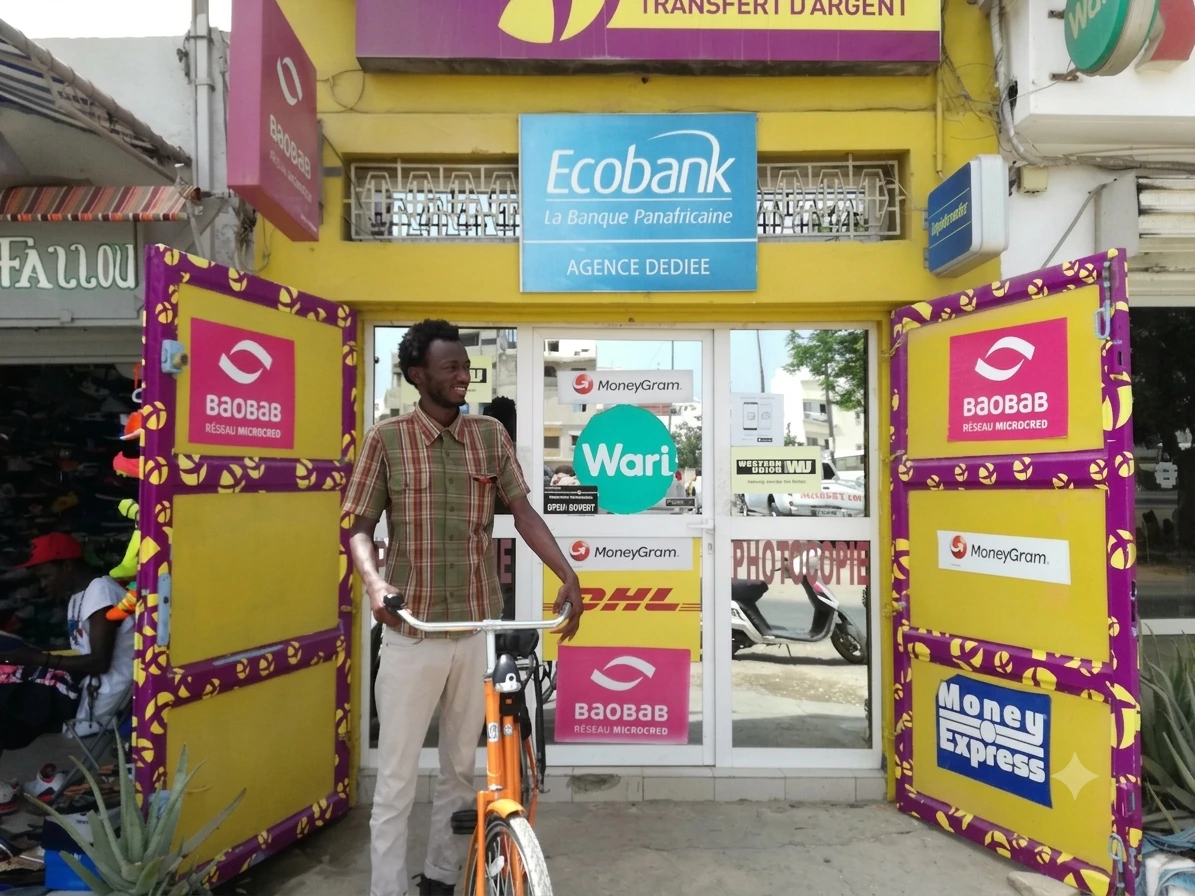
Research in the field
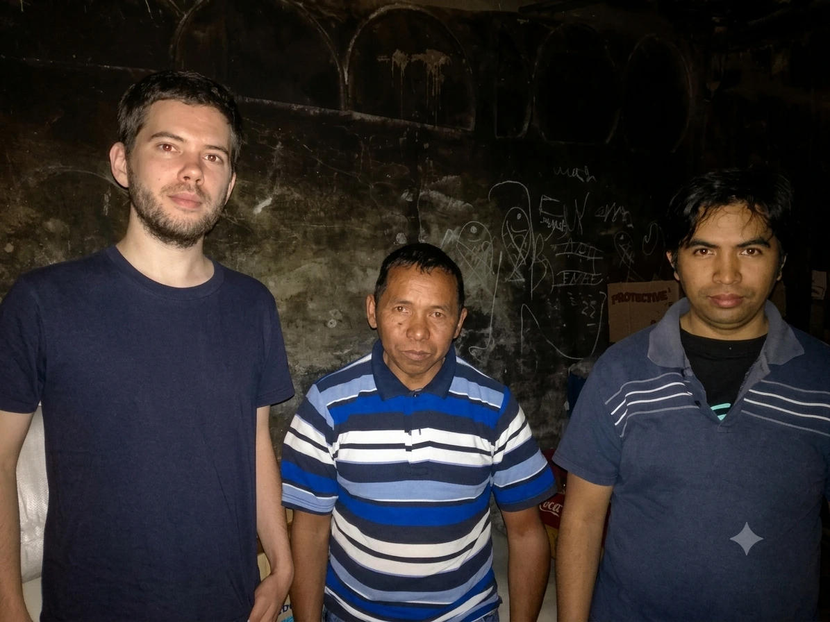
Before any screen was designed, the Dakar team went into Baobab’s local branches and talked to clients in guerrilla mode: conversations, a few printed interface sketches, questions about habits and frustrations. These early sessions were enough to understand priorities and avoid spending time on things that didn’t matter to users.
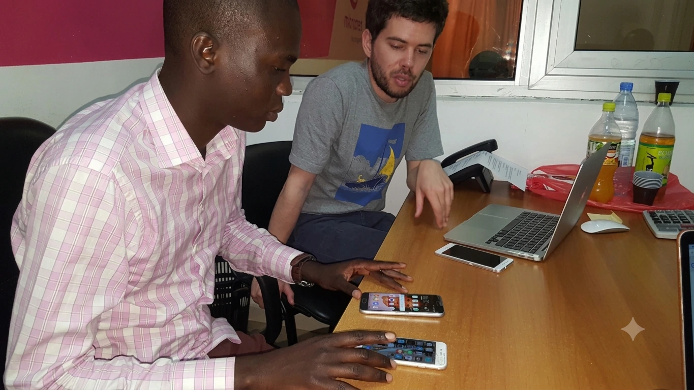
What came back was more nuanced than expected. A few things stood out immediately.
Some clients had difficulty reading but were surprisingly confident smartphone users. They had their own learning infrastructure with YouTube tutorials where people demonstrated how to use apps step by step. This was a different relationship with technology than most design guides assume and it suggested that the interface needed to work without relying on text comprehension alone, and that video tutorials could be a meaningful part of the onboarding experience rather than an afterthought.
The connectivity issue was more fundamental. Many users don’t live in cities and they travel a lot. Data roaming is expensive, so a banking app that requires a stable internet connection is, for large parts of the target population, an app that simply doesn’t work when they need it most. The team needed to think seriously about offline functionality and the solution we developed allowed users to check their balance by sending an SMS, keeping the core utility of the app accessible even without a connection.
Designing and iterating
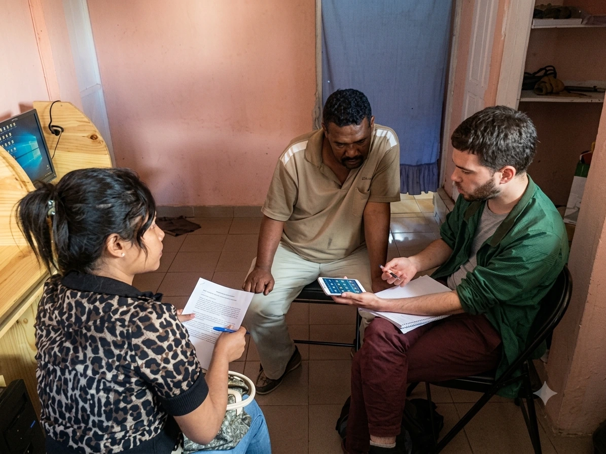
I built the first clickable prototype in InVision over a few weeks. It covered the main user journeys: account creation, bill payment, money transfer, and the Taka credit application. Then we went to Dakar for a first round of semi-moderated testing with six users.
The sessions were revealing. Watching real users, in their actual context, interact with something you’ve designed is a different kind of feedback from any stakeholder review. It’s faster, more specific, and often more humbling.
One of the clearest outcomes was the need for a colour-coded navigation system. The different sections of the app (credit, transfers, payments) needed to be distinguishable at a glance, independent of the label text (ex. orange for credit, green for transfers). A small change on screen, a significant one in terms of accessibility.
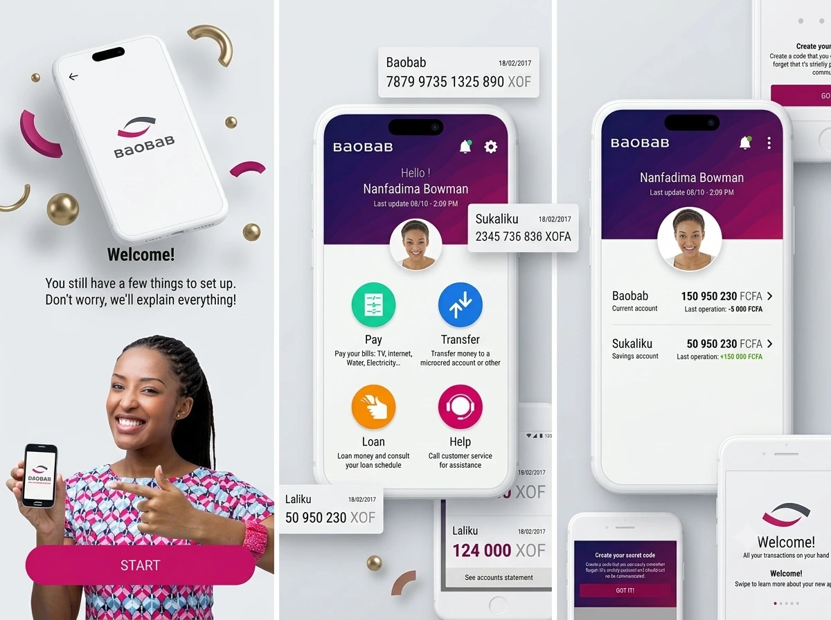
I incorporated the feedback, rebuilt the relevant parts of the prototype, and flew to Madagascar for a second round of testing. The difference between the two rounds was visible in the room: users who had struggled with certain flows in Dakar moved through the updated version with noticeably more ease. A few of them thought they were already using the finished app. That kind of reaction, the moment someone stops interacting with a prototype as a test subject and starts using it as a tool, is one of the clearest signals that something is working.
Constraints and tradeoffs
Not everything made it into the first version. Bill payments were scoped to two providers covering water and electricity, because each energy provider had its own API and the development complexity of integrating all of them was too high for the initial launch: a narrower but reliable feature set over an ambitious but unstable one.
The MVP was ready in six months, but publishing on the Google and Apple stores turned out to require a banking licence that the group hadn’t fully secured yet, which delayed the public launch beyond what the team had planned for.
What it produced
The research and testing process, conducted on the ground with real users, produced something that was shaped by the actual context it was going into. The colour-coded navigation, the SMS balance feature, the video tutorials, none of these came from a brief or a user persona document but from conversations and observations that couldn’t have happened remotely.
The qualitative feedback from testing was strongly positive and users were enthusiastic, sometimes disarmingly so. The faces of people testing the second prototype, people who had grown up without access to banking services, lighting up at the idea of being able to open an account from their phone, was one of the more memorable moments.
Learnings
The most important thing I took away from this project was the irreplaceability of field research. Going to Senegal and Madagascar was how we found out that people were watching YouTube to learn apps, that they were regularly out of data coverage, that colour mattered more than text in a context where literacy varied. Without that, we would have built something reasonable on paper that missed the real experience of its users entirely.
It also reinforced something I’ve believed since: design methods work when you actually apply them. “Trust the process” sounds like a poster slogan, but the process here produced concrete, testable insights that aligned what users needed with what the business was trying to build. That alignment is never automatic and someone has to create the conditions for it.
Designing for users whose context is radically different from your office?
Email me with: who the users are, where they are, and what you currently know about them.
GET IN TOUCH