Orange Checkout
The checkout is where the whole store converts — or doesn't. Every change had to hold up on web and mobile, for every product line, without breaking a funnel that millions of customers use.
Continuous improvement, one hypothesis at a time: user tests, then A/B tests in production. New purchase journeys for the home-cinema set-top box and its speakers. The checkout migrated to OUDS, the group's new design system.
A checkout kept to four steps that read the same on web and mobile; OUDS adopted on the funnel rather than worked around; a Figma plugin that generates webview variants from a single mockup.
For nine months I owned the checkout of Orange's online store — from the cart to the payment — in a team of three designers. The work was continuous improvement in a large organisation: SAFe sprints, user research with the research team, A/B tests with product, alignment with the cart and DesignOps teams. Two things stood out: designing the purchase journey for the new home-cinema set-top box and its speakers, and championing OUDS, Orange's unified design system, until the checkout ran on it. On the side, I built a Figma plugin that generates the store's many webview variants from one master mockup.
Overview
Orange is France’s leading telecom operator. Its online store sells phones, plans, internet boxes and TV equipment to millions of customers, on web and in the mobile app. The checkout is the last mile of every sale: cart, delivery, payment, confirmation.
I joined the store’s design team as the designer responsible for that funnel. Three designers in total, each owning a part of the journey; around us, the cart team, DesignOps, the research team, and the product and engineering teams organised in SAFe.
Team: 3 designers; cart, DesignOps and research teams; product owners and developers in SAFe trains
Location: Paris, France
The Challenge
A checkout is never finished. Every product line adds a case — a plan with a commitment, a device with a payment schedule, a bundle delivered in two parcels — and every case is a chance to lose the customer. The funnel had to:
- read the same on web and mobile, so a customer who starts on one can finish on the other;
- absorb new products without adding steps;
- move to OUDS, the new design system, without a big-bang redesign;
- change only on evidence: a hypothesis, a test, a measure.
How I worked
User tests first, then A/B tests. With the research team, each hypothesis was tested with customers on prototypes before being built, then A/B-tested in production with product. Changes that didn’t move the numbers were dropped, even when the team liked them.
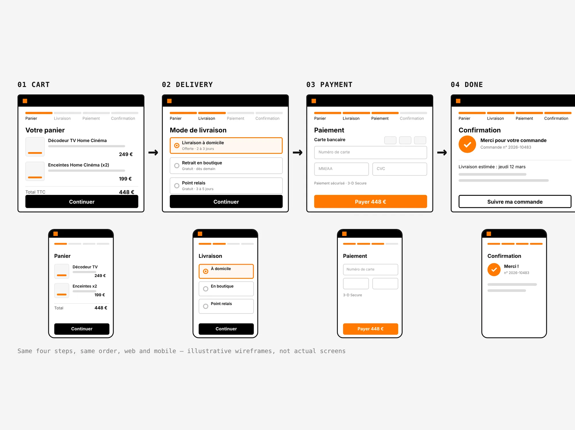
One funnel, four steps. Cart, delivery, payment, confirmation — in the same order, with the same component in every context. New cases were handled inside a step, never by adding one.
Illustrative wireframes — not actual screens of the store.
The home-cinema bundle. The set-top box and its speakers were launched as a bundle. The journey had to present them as one decision: one product card in the cart, one delivery, one payment, no detour to a second product page.
OUDS on the checkout. Orange was moving to OUDS, its unified design system — one set of semantic tokens and components for every brand, in light and dark. I championed it on the funnel: components migrated, patterns documented, reviews with DesignOps, so the team adopted it instead of working around it.
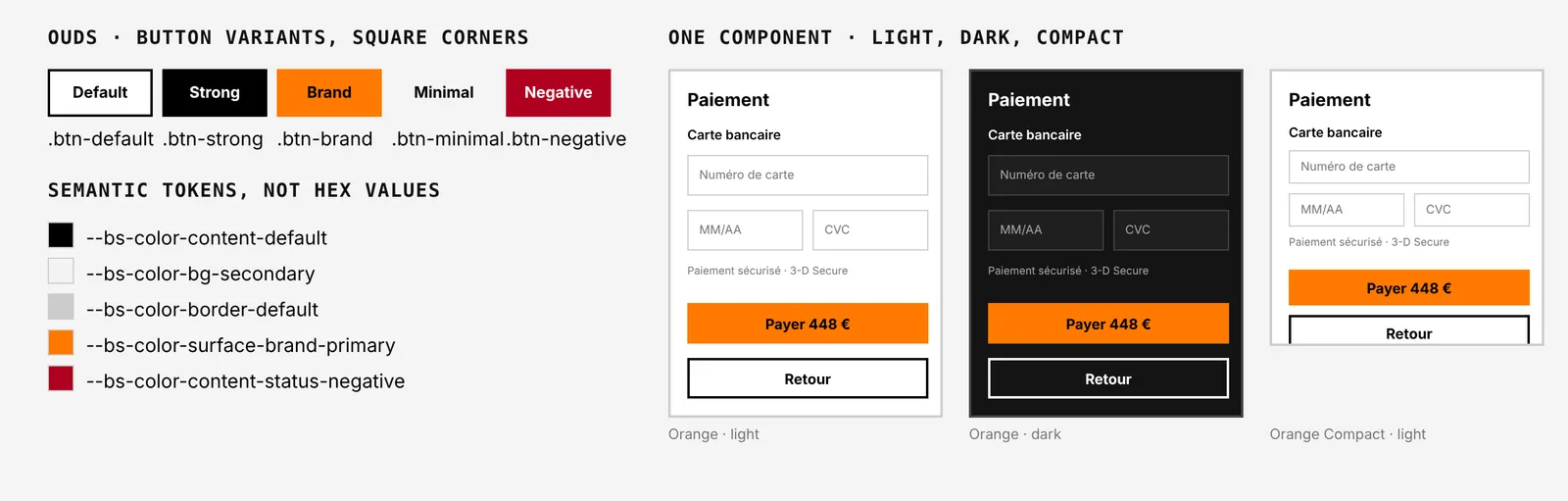
Illustration — not actual screens of the store.
A Figma plugin for webviews. The store runs many webviews derived from the same screens — devices, themes, languages, campaigns. I built a Figma plugin that generates the variants automatically from one master mockup. No more manual declination; one source of truth.
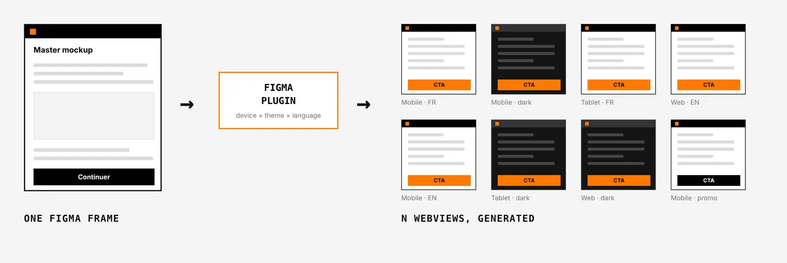
Illustrative diagram — not actual screens of the store.
Results
- The checkout kept to four steps on web and mobile while absorbing new product lines, including the home-cinema bundle.
- OUDS adopted on the funnel, with documented patterns the other designers reused.
- A Figma plugin in daily use by the team to generate webview variants.
Key Learnings
Evidence beats taste
In a funnel used by millions, the test decides. The hardest part is dropping an idea the team loved because the numbers didn’t move.
Adoption is a design problem
A design system is adopted when using it is easier than not using it. Documented patterns and reviews did more than any mandate.
Automate the boring part
Declining the same screen into twenty webviews is not design. A plugin gave that time back to the work that is.
Running an e-commerce funnel at scale?
Want a designer who tests before shipping? Let's talk.
GET IN TOUCH