Toyota
toyota.com.au was underperforming. Key sections of the site like Own or Discover, weren't driving the interactions that mattered: service bookings, dealer leads, finance enquiries. The site had the traffic but not the conversion.
A full redesign of toyota.com.au and the myToyota owner app, grounded in the 'Product Love' concept, telling the story and personality of each vehicle rather than listing specs. Backed by structured A/B testing to validate navigation and layout decisions before shipping.
- Significant uplift in interactions across Own and Discover sections after A/B-validated nav changes - Design system built from scratch and adopted across the team, with a documented contribution process - Consistent experience delivered across web and the myToyota mobile app
Toyota Australia's digital presence wasn't converting. I led the UX redesign of toyota.com.au and the myToyota app at R/GA Melbourne, working across a cross-functional team of designers, a motion designer, SEO and copywriting. The work was anchored in R/GA's 'Product Love' concept (vehicle personality over spec sheets) and validated through A/B testing on key navigation patterns. I also proposed and led a design system project from scratch, running workshops to align the team on contribution processes. The result was a more coherent, testable, and maintainable digital product.
Overview
Toyota Australia’s website had a problem that’s common and easy to miss: it looked fine. Traffic was healthy. But users weren’t doing what the business needed them to do. Interactions in key ownership and discovery sections were low. The site was generating impressions but failed to convert properly.
This wasn’t a branding problem. It was a design and information architecture problem and fixing it required a proper redesign, not a cosmetic refresh.
Team: R/GA Melbourne (Lead UI Designer, motion designer, copywriter, SEO analyst) + Toyota Australia stakeholders
Location: Melbourne, Australia
The context
I joined R/GA Melbourne as Lead UX Designer on Toyota Australia, the agency’s largest account at that time. The team included a Lead UI Designer, a motion designer, a copywriter, and an SEO analyst. We worked closely with stakeholders on the Toyota side to balance brand direction with performance goals.
My responsibility was the end-to-end UX: information architecture, interaction model, and the overall experience logic across the site and the myToyota owner app. I facilitated design thinking workshops with the full team to align on objectives and establish working processes before any screen was designed.
Product Love
The creative framework we worked within was R/GA’s “Product Love” concept. The premise was straightforward: Toyota customers don’t buy a vehicle the way they buy a household appliance. They develop a relationship with it and the site needed to reflect that: telling the story and personality of each model rather than presenting a catalogue of specs.
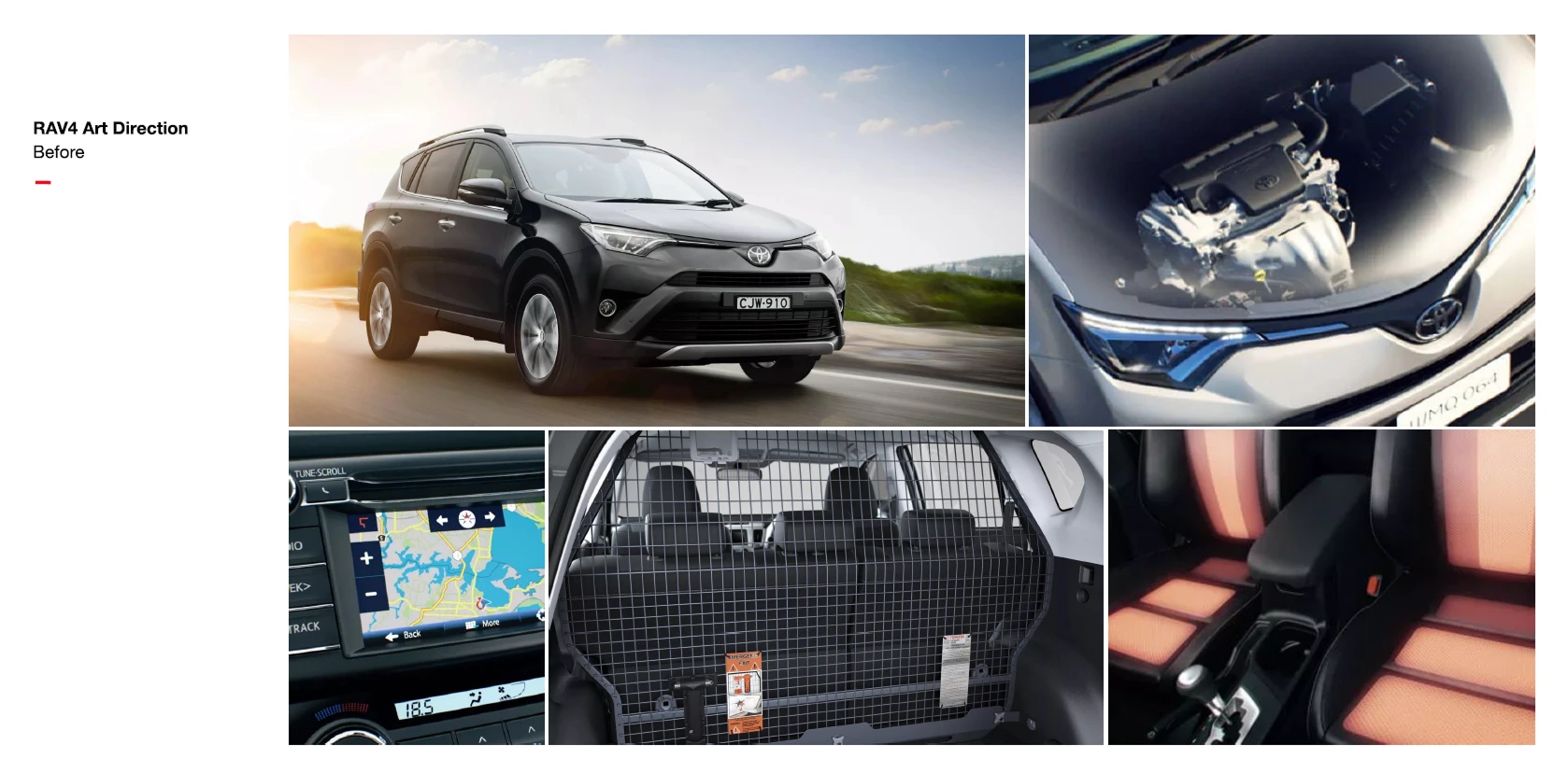
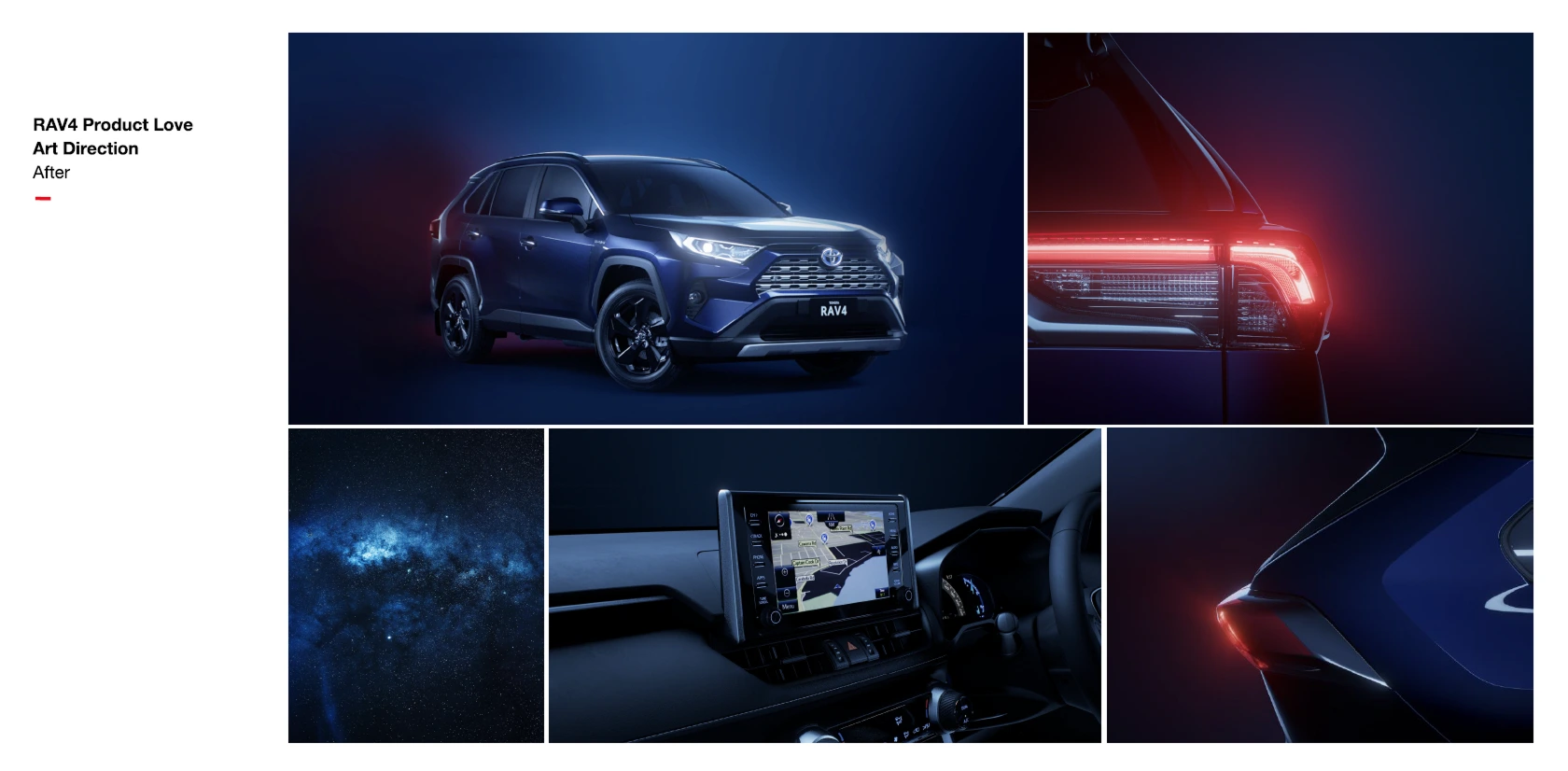
In practice, this meant rethinking how vehicles were presented across the site. Lifestyle photography replaced studio shots. Animation added character to page transitions. The content hierarchy shifted from features to feeling and the UX had to support that shift without sacrificing clarity or conversion.
Where the data came in
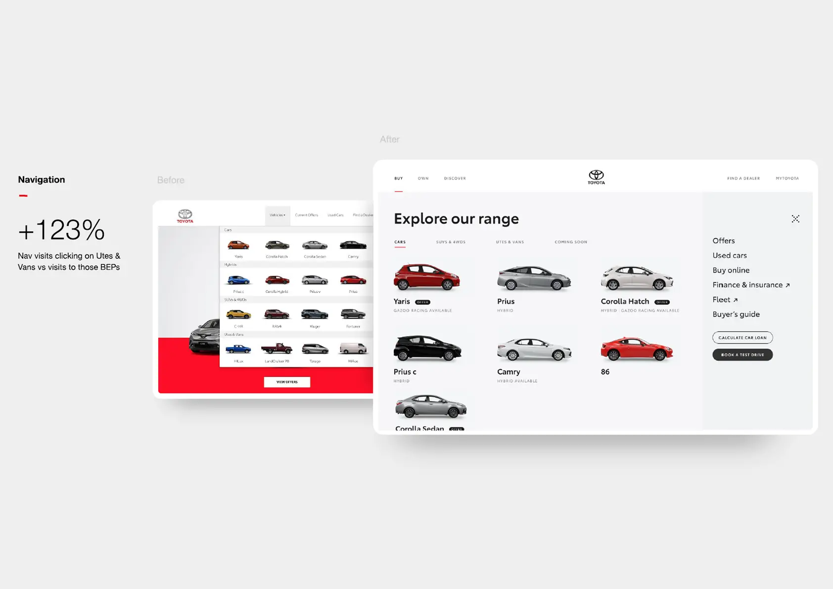
Before the redesign could ship, the navigation changes needed to be tested. The problem was specific: interactions with secondary content in the right-hand column of the main nav (particularly in the Own and Discover sections) were low. Users weren’t seeing or engaging with what was there.
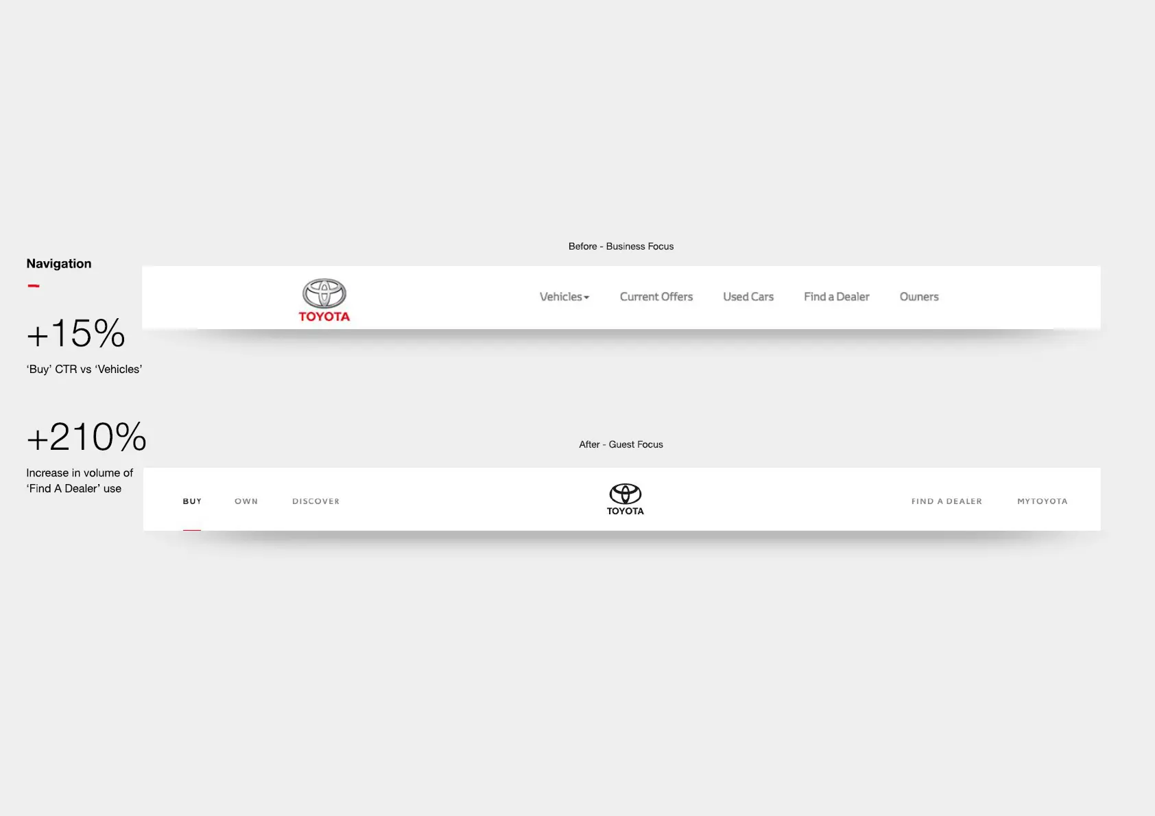
The hypothesis was structural: the hero image and the secondary column were competing for attention, and the column was losing. The fix proposed was to swap the layout, move the hero image to the right and put the links on the left where the eye lands first.
We ran A/B tests across three nav states: Buy, Own, and Discover. Each test compared the original layout (control) against the proposed swap (variant).
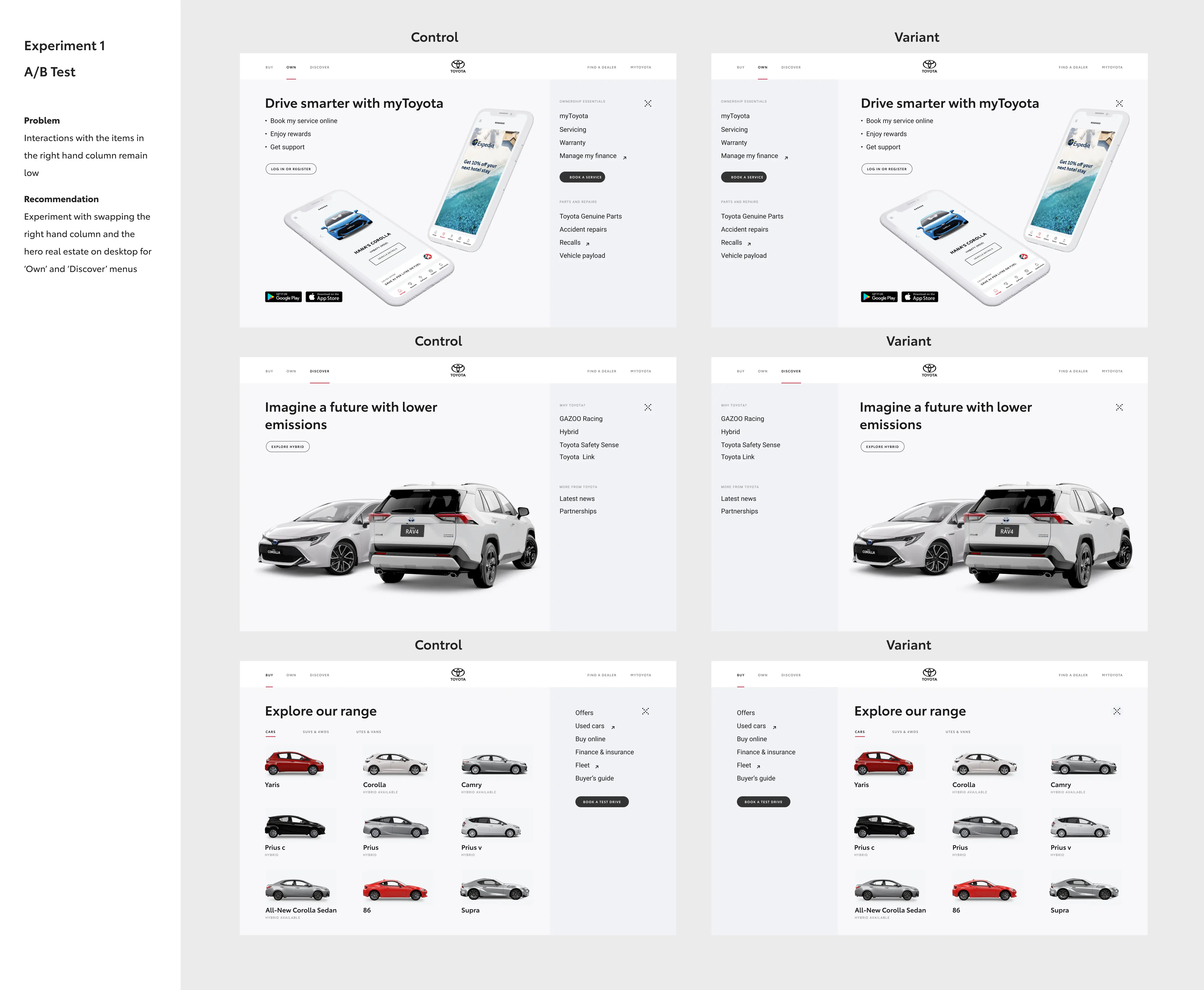
The variant consistently outperformed the control in the sections that mattered most. Navigation interactions increased and the content that had been invisible became useful.
The design system
One of the things I noticed early was that the team had no shared system for deciding what to design versus what to reuse. Decisions about new components were being made individually, often resulting in near-duplicates that created maintenance overhead and inconsistency across the site.
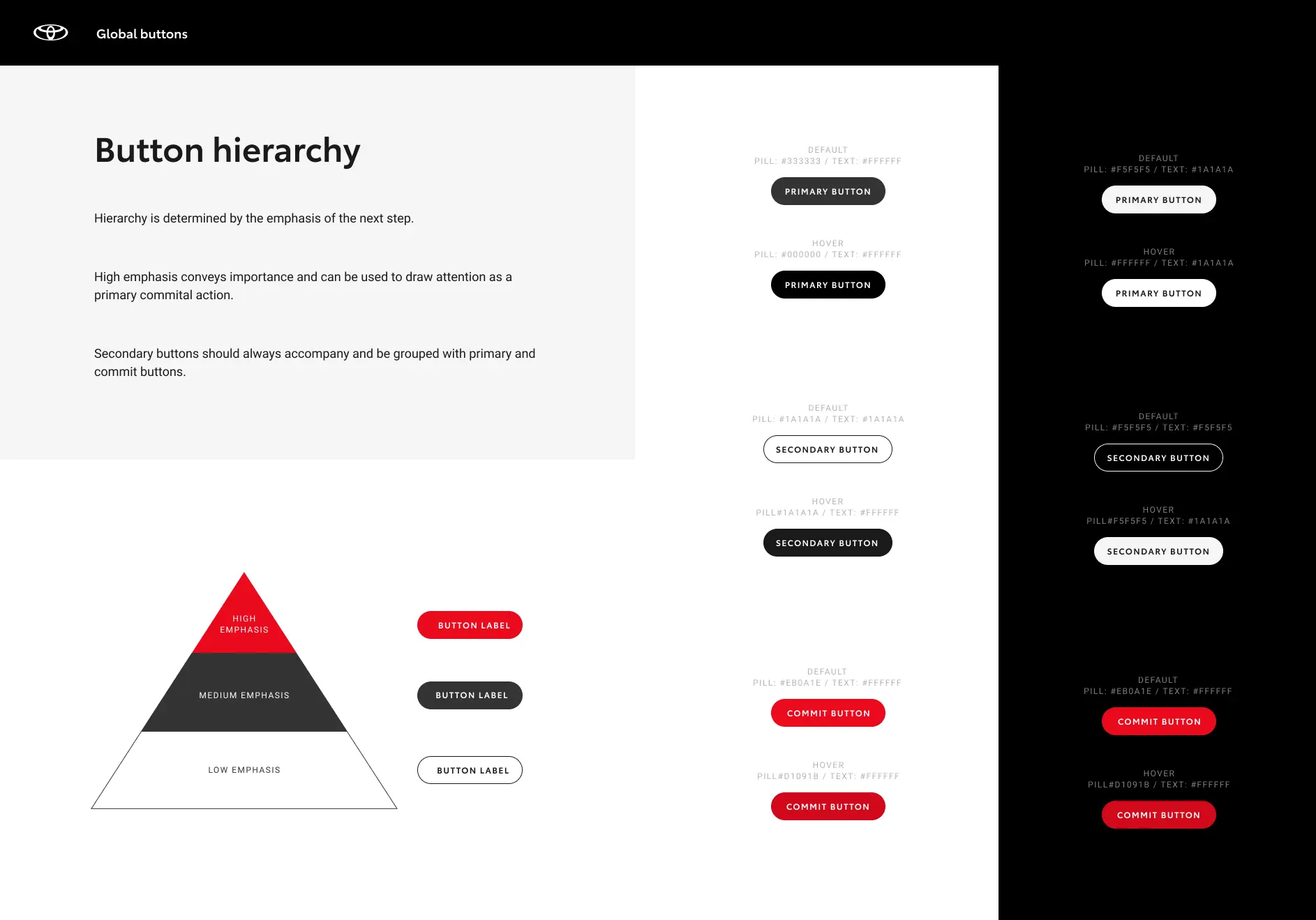
I proposed a design system project, ran the workshops to align the team, and built the contribution process from scratch. The core of it was a decision tree: when a designer encounters a new component need, they work through a structured set of questions: does something similar exist? Does it fulfil all requirements? Is it a bug or a new variation? Can we amend an existing component or does this require a new pattern?
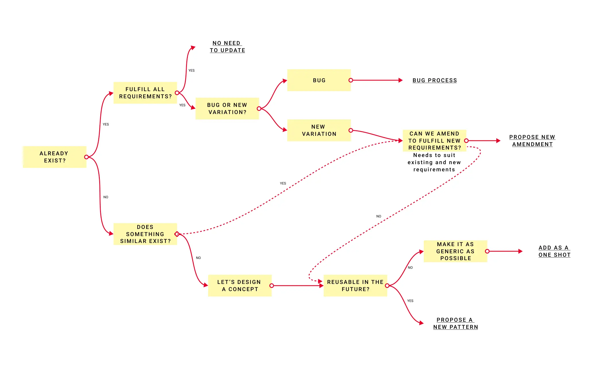
It sounds procedural, but the impact was practical. Designers spent less time second-guessing themselves, reviews got faster, the codebase got cleaner and new team members had something to orient themselves against from day one.
The myToyota app
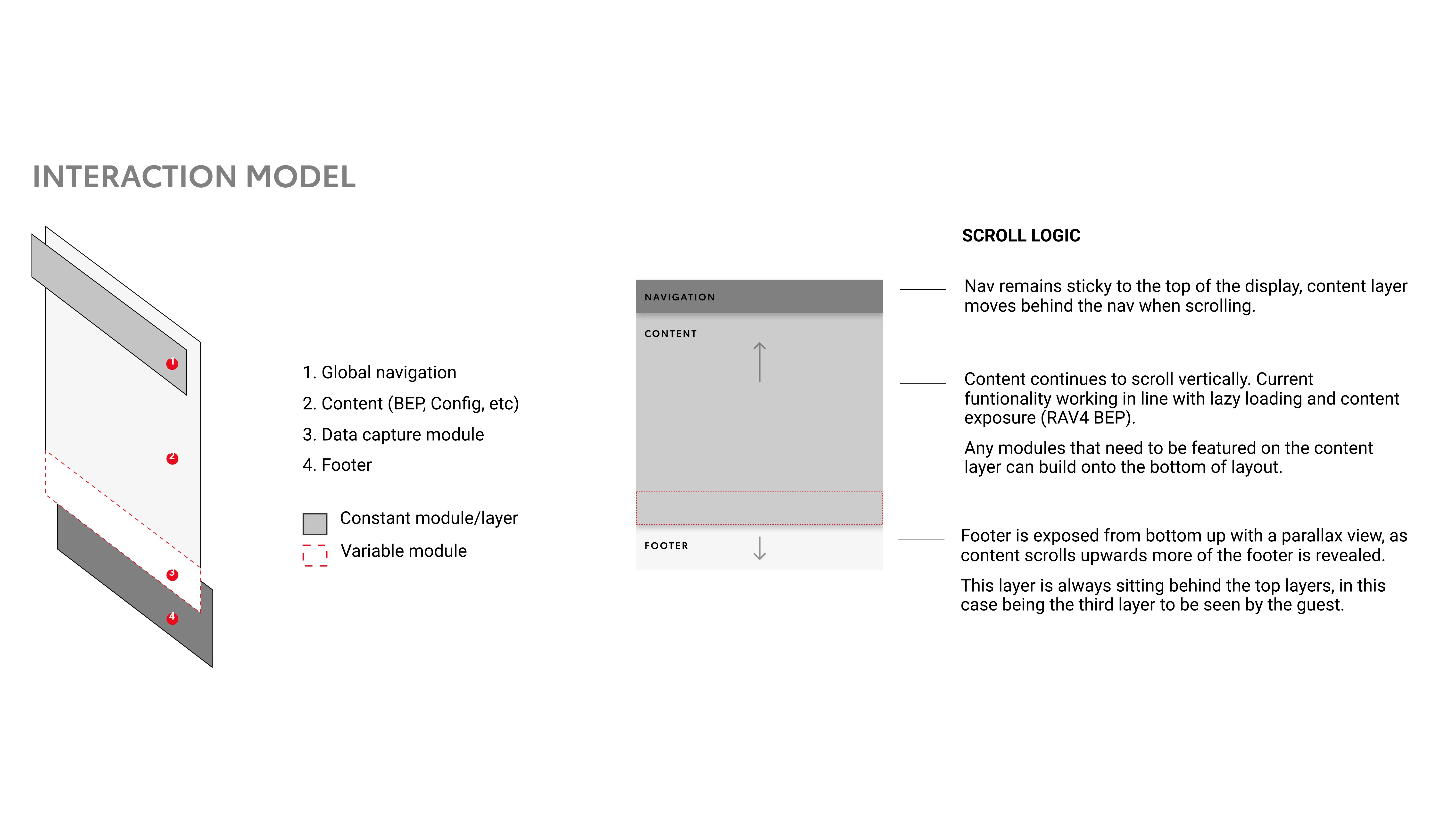
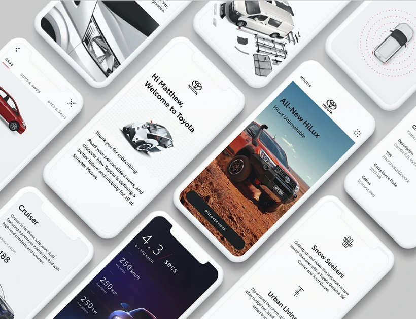
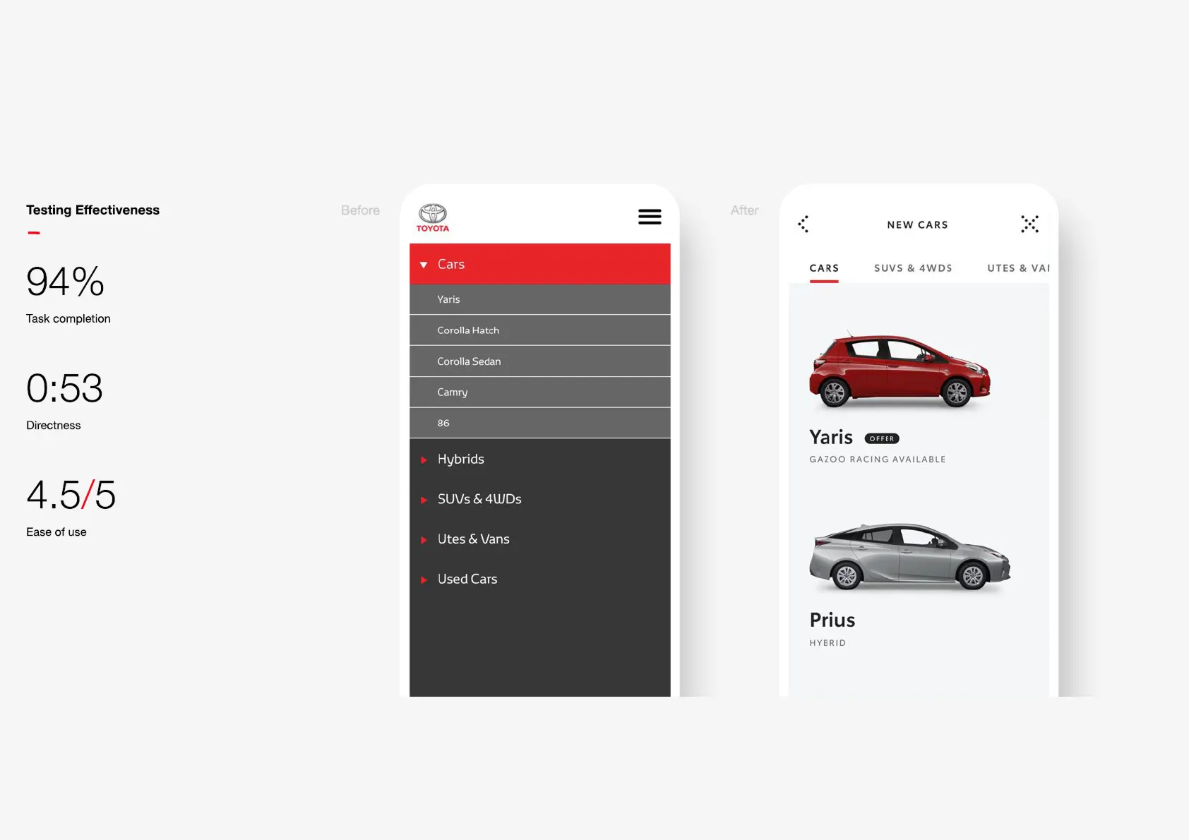
Alongside the website, we redesigned the myToyota owner app, the companion experience for existing Toyota customers. The app covered servicing bookings, rewards, finance management, and owner support. The interaction model was a consistent four-layer structure: global navigation, content, data capture, and footer. This layered architecture made the experience predictable and extensible as new features were added.
What it produced
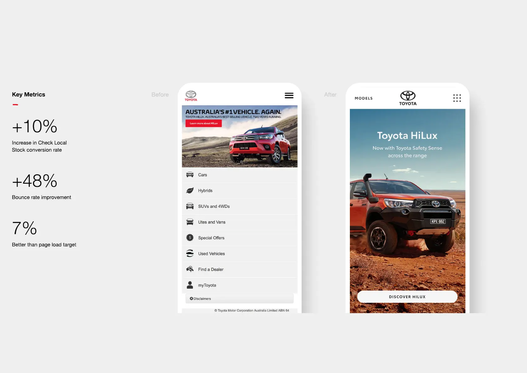
The redesign delivered measurable improvements where they mattered:
- Navigation interactions increased across the Own and Discover sections after the A/B-validated layout changes
- Design system adoption reduced inconsistency and sped up both design and review cycles
- Cross-platform coherence between web and the myToyota app created a unified owner experience
Learnings
Working on a large brand digital product at scale is a different discipline from early-stage product design. The constraints are tighter, the stakeholder surface is wider, and the decisions you make have to survive handoffs to development teams you may not be in the room with.
The design system work was the most transferable lesson. Building shared processes that outlast you on a project, that let other designers make better decisions without asking you, is one of the most useful things a Lead designer can do. It’s the kind of work that makes everything else ship faster and break less.
The A/B testing approach also left a mark. Testing navigation before committing to a full redesign gave the team confidence to ship. Without that data, the redesign would have relied on opinion and seniority rather than evidence. In a large organisation with multiple stakeholders, that difference matters.
Redesigning a site that has traffic but not conversion?
Email me with: current metrics, what you've already tried, and your team structure.
GET IN TOUCH